The second thing to tackle in our DIY kitchen renovation is the backsplash. 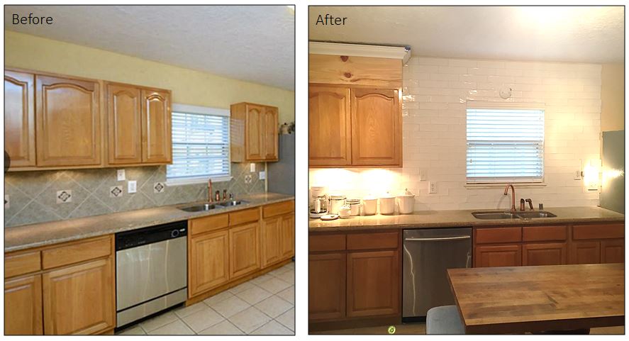
The backsplash in the kitchen does nothing for me. It’s just giant, boring, floor tiles with little cutouts. It doesn’t have a personality, and in my opinion, just looks bleh and cheap. It’s not my style at all, see:
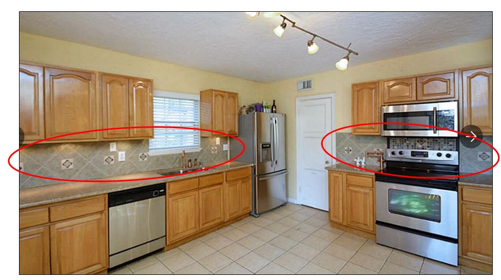
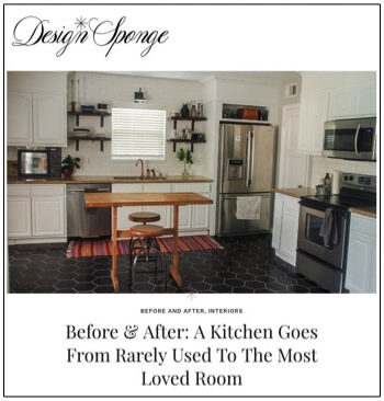
So, I want to rip it out and start fresh. Here’s what I’m thinking: I’m thinking handmade subway tiles with an updated twist. I’m thinking bright, tall, white, clean, open, and a tinge modern like so: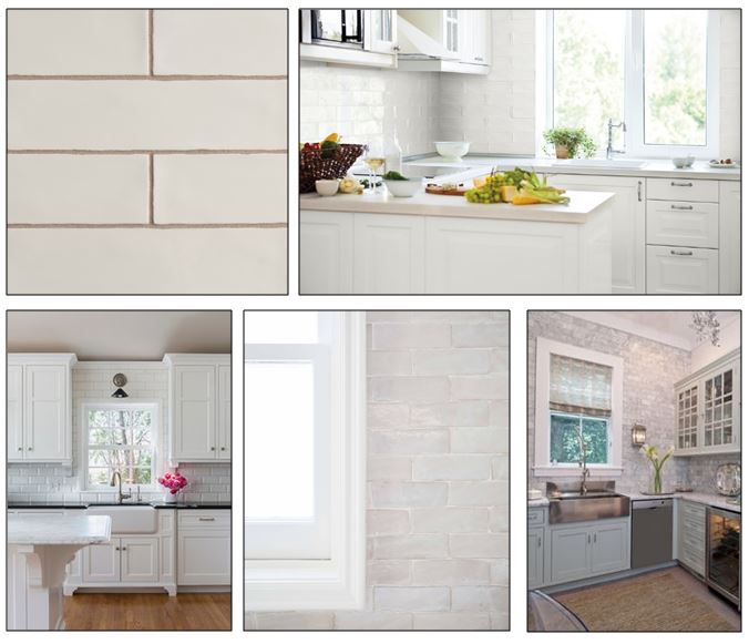
The Journey:
First, David removed the two cabinets that flanked the window. Then he took out the old backsplash and drywall, and cut a channel to add a light above the sink.
Then he filled in the space with new drywall: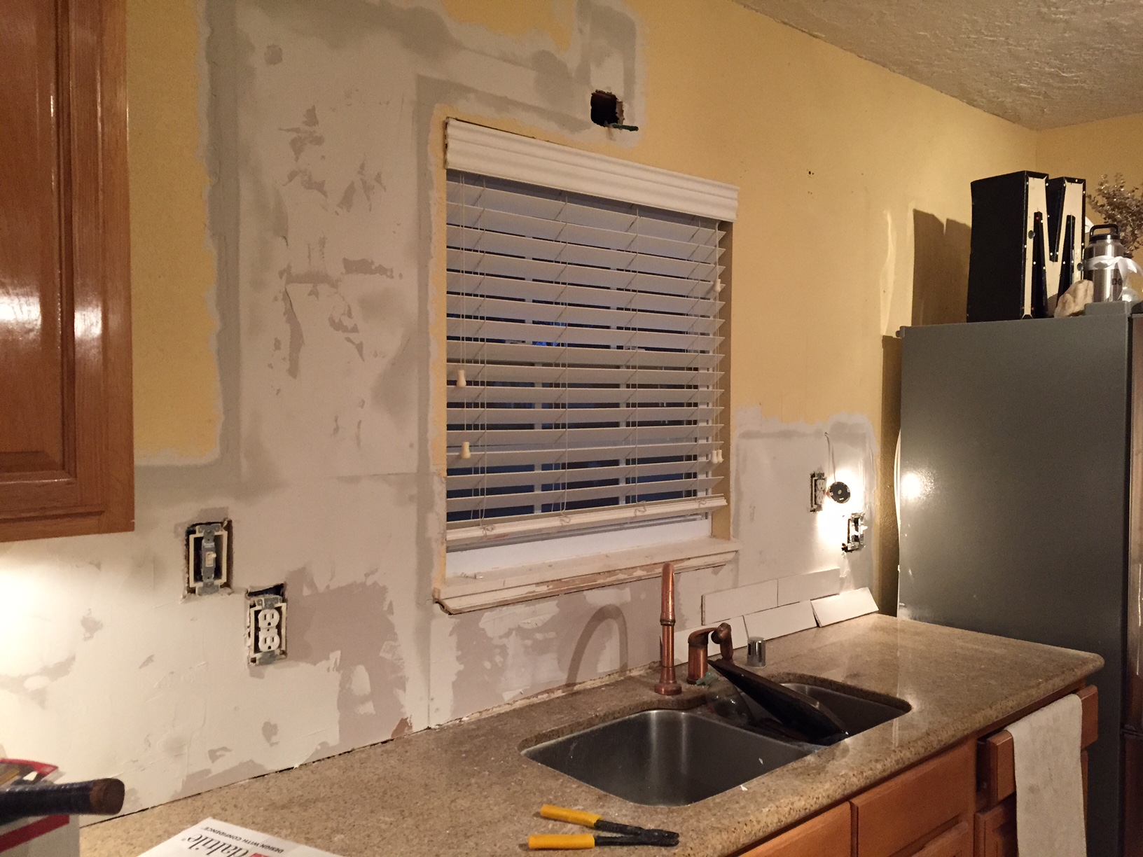
Then we evenly applied thin set to the walls and placed the tiles:
And Ta-Da! Here’s what three full days of back and neck cramps looks like:
Here’s the final product with sealed grout: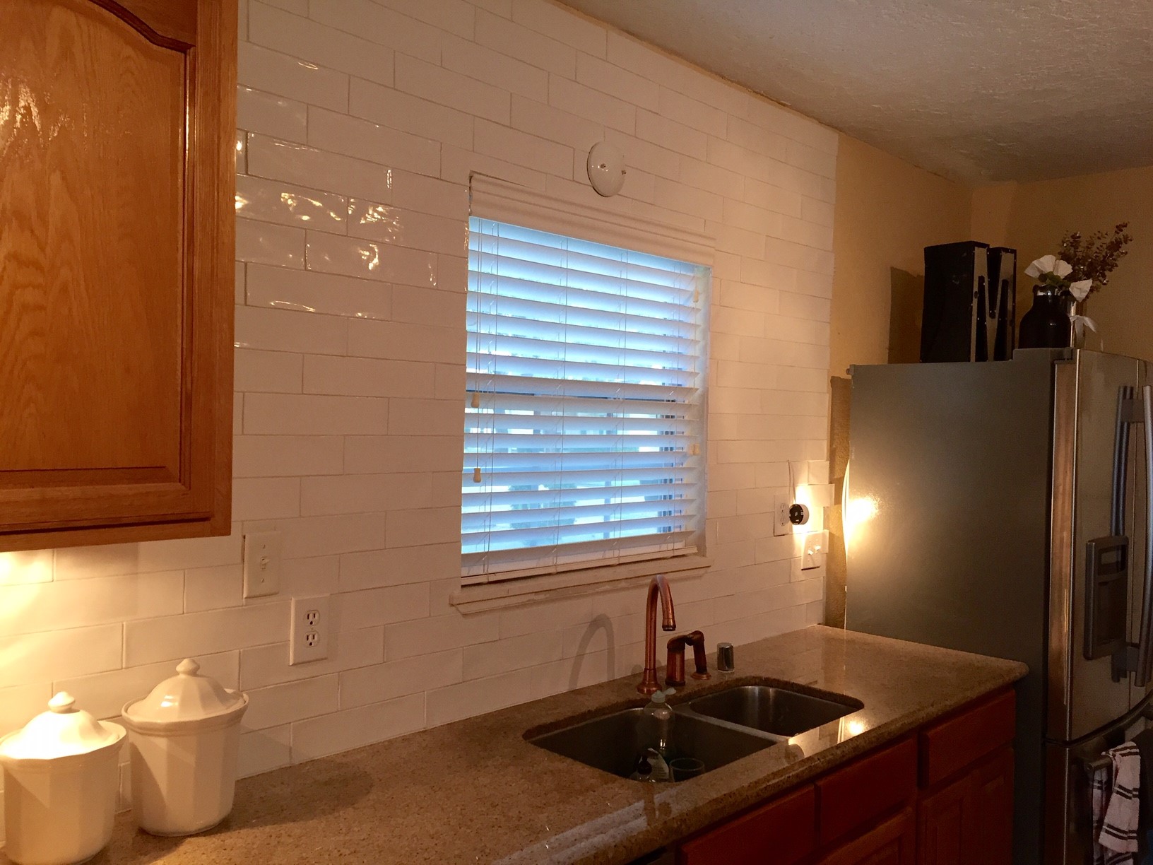 I’m so grateful we chose the handmade-subway-tile-look. It’s so forgiving.

Updating the backsplash was just one piece of the massive kitchen renovation we have planned. Stay tuned for more!

